

The Art of Freshness: A Case Study of Sushi Bucket’s Digital Presence
The Art of Freshness: A Case Study of Sushi Bucket’s Digital Presence
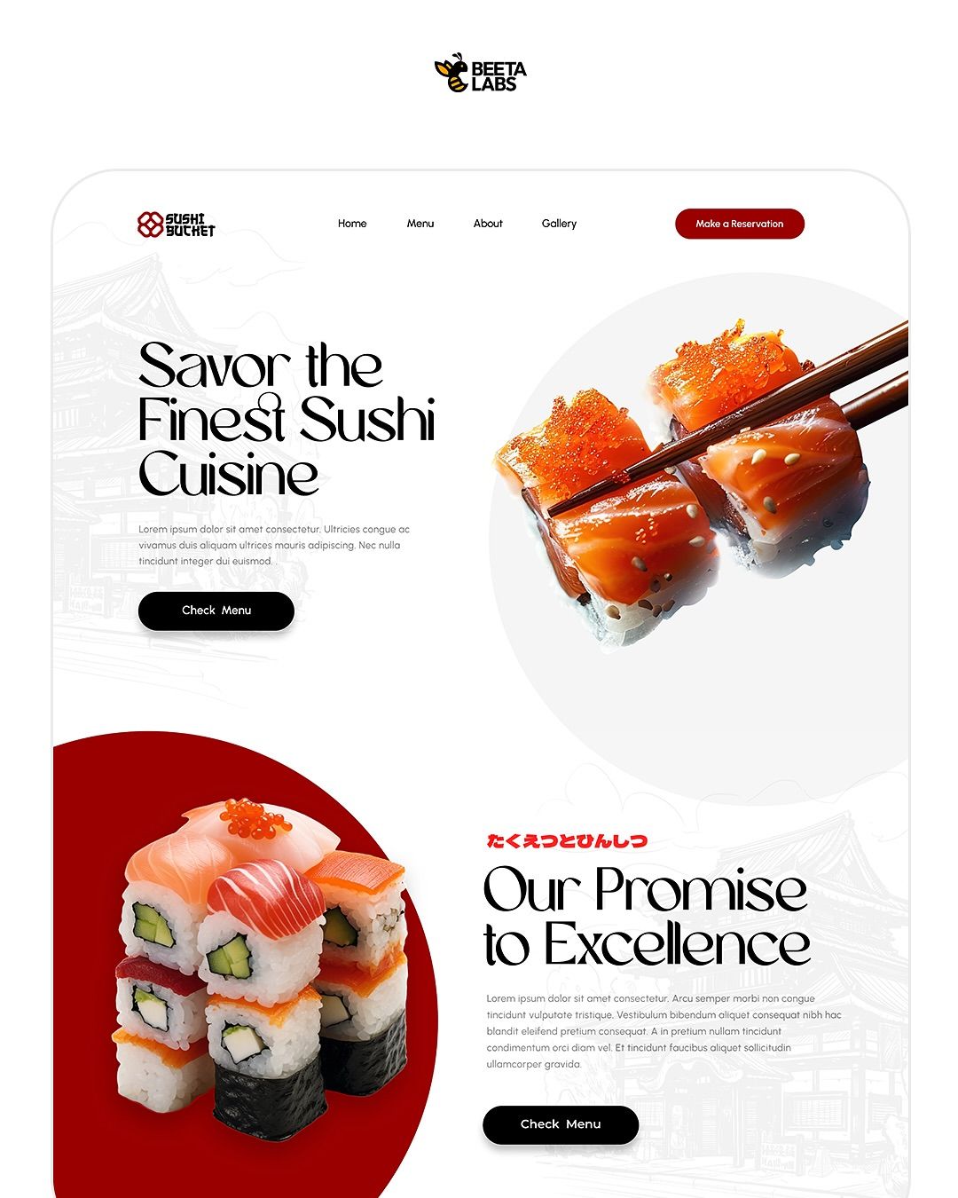
Overview
Designed by Beeta Labs, the visual identity for Sushi Bucket represents a departure from the traditional dark, moody atmosphere often associated with high-end sushi bars. Instead, this concept embraces a “Light Mode” philosophy, prioritizing high-key visuals and expansive white space to communicate one core brand value: freshness.
Design Philosophy: The Power of Negative Space
The “Sushi Bucket” landing page is a masterclass in minimalist composition. By utilizing a clean, white canvas, the design creates a “breathable” interface that mirrors the precision of a sushi chef’s workstation.
The Z-Pattern Journey
The layout is strategically engineered to guide the user’s eye through a specific conversion path:
-
Identity: The logo (top-left) establishes the brand immediately.
-
Action: The crimson “Make a Reservation” button (top-right) serves as the primary goal.
-
Engagement: The headline, “Savor the Finest Sushi Cuisine,” captures the user’s attention with high-contrast, elegant typography.
-
Conversion: The “Check Menu” buttons provide a clear next step for the hungry browser.
Typography: Modern Elegance
Unlike the raw, ink-brushed styles of its competitors, Sushi Bucket opts for a high-contrast serif typeface.
-
The Display Font: Featuring artistic ligatures and sharp terminals, the headline font suggests a “boutique” or “premium” feel. It bridges the gap between traditional culinary arts and modern fashion aesthetics.
-
Cultural Cues: The inclusion of Japanese characters above the “Our Promise to Excellence” header acts as a stamp of authenticity, grounding the modern design in cultural heritage.
Color Palette & Visual Cues
The color strategy is “food-first.” By keeping the UI colors restricted, the natural saturation of the food photography becomes the focal point.
| Tone | Application | Psychological Impact |
| Pure White | Background/Canvas | Implies hygiene, clarity, and premium quality. |
| Crimson Red | Brand Accents & CTAs | Stimulates appetite and creates a sense of urgency. |
| Midnight Black | Secondary Buttons | Provides a grounded, sophisticated contrast. |
| Ghost Grey | Background Line Art | Adds “texture” and cultural depth without clutter. |
Illustrative Depth
A subtle but effective detail is the faded pagoda line art layered behind the text. This technique adds a secondary layer of storytelling. It provides a sense of place and history, reminding the user of the traditional roots of the cuisine, while the sharp, modern UI keeps the experience rooted in the present.
Conclusion
The Sushi Bucket design by Beeta Labs proves that “less is more” in the culinary digital space. By stripping away heavy textures and dark gradients, the design allows the vibrant https://zingsushi.com/ colors of the salmon and roe to “pop,” effectively making the product the undeniable star of the show. It is a design built for the modern diner who values transparency, freshness, and effortless elegance.
